' fill='none' stroke='%23304560' stroke-miterlimit='10' stroke-width='2'/%3e%3c/svg%3e)

Pearson Correlation vs Simple Linear Regression
Dr. Vanessa Cave
06 July 2021
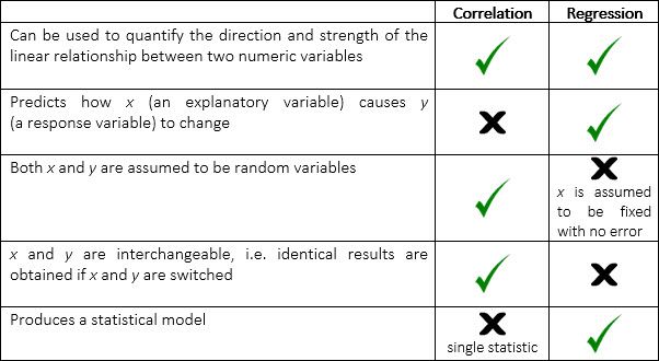
Both Pearson correlation and simple linear regression can be used to determine if two numeric variables are linearly related. Nevertheless, there are important differences between these two approaches. In this blog, we discuss the differences between the two and how they can be used in statistics.
So what is the difference between the Pearson correlation and simple linear regression? The Pearson correlation measures the strength and direction between two numeric variables while simple linear regression describes the linear relationship between a response variable and an explanatory variable.
Read on to find out more about both the Pearson correlation and simple linear regression.
What is the Difference Between Pearson Correlation and Simple Linear Regression?
Pearson correlation is a measure of the strength and direction of the linear association between two numeric variables that makes no assumption of causality. Simple linear regression describes the linear relationship between a response variable (denoted by) and an explanatory variable (denoted by) using a statistical model. This model can be used to make predictions.
The following table summarises the key similarities and differences between Pearson correlation and simple linear regression.
Pearson Correlation
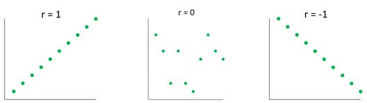
Pearson correlation is a number ranging from -1 to 1 that represents the strength of the linear relationship between two numeric variables. A value of 1 corresponds to a perfect positive linear relationship, a value of 0 to no linear relationship, and a value of -1 to a perfect negative relationship.
The Pearson correlation between variables and is calculated using the formula:
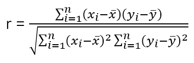
where is the mean of the values, and is the mean of the values, and is the sample size.
The Pearson correlation is also known as the product-moment correlation coefficient or simply the correlation.
Simple Linear Regression
If we are interested in the effect of an variate (i.e. a numeric explanatory or independent variable) on a variate (i.e. a numeric response or dependent variable) regression analysis is appropriate. Simple linear regression describes the response variable by the model:
where the coefficients and are the intercept and slope of the regression line respectively. The intercept is the value of when is zero. The slope is the change in for every one unit change in . When the correlation is positive, the slope of the regression line will be positive and vice versa.
The above model is theoretical, and in practice there will be error. The statistical model is given by:
,
where , a variate of residuals, represents the difference between the predicted and observed values. The “hat” (^) accent is used to denote values estimated from the observed data. The regression coefficients, and , are estimated by least squares. This results in a regression line that minimizes the sum of squared residuals.
How Can the Pearson Correlation be used?
| Check out our Genstat tutorial video on Pearson correlation vs simple linear regression. |
You can calculate the Pearson correlation, or fit a simple linear regression, using any general statistical software package. Here, we’re going to use Genstat.
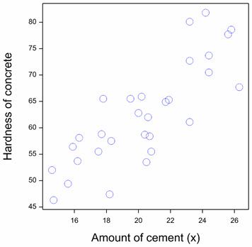
Example: A concrete manufacturer wants to know if the hardness of their concrete depends on the amount of cement used to make it. They collected data from thirty batches of concrete:
Amount of cement | Hardness of concrete | Amount of cement | Hardness of concrete |
16.3 | 58.1 | 14.7 | 46.3 |
23.2 | 80.1 | 20.2 | 65.9 |
18.2 | 47.4 | 19.5 | 65.5 |
20.8 | 55.5 | 20.5 | 53.5 |
21.9 | 65.3 | 25.6 | 77.7 |
23.2 | 72.7 | 24.4 | 73.7 |
17.8 | 65.5 | 21.7 | 64.9 |
24.2 | 81.8 | 18.3 | 57.5 |
16.2 | 53.7 | 20.0 | 62.8 |
23.2 | 61.1 | 20.7 | 58.4 |
20.4 | 58.7 | 24.4 | 70.5 |
14.6 | 52.0 | 25.8 | 78.6 |
17.7 | 58.8 | 20.6 | 62.0 |
15.9 | 56.4 | 17.5 | 55.5 |
15.6 | 49.4 | 26.3 | 67.7 |
The scatterplot of the data suggests that the two variables are linearly related:
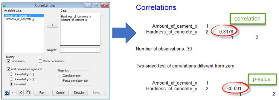
Let’s first assess whether there is evidence of a significant Pearson correlation between the hardness of the concrete and the amount of cement used to make it. Our null hypothesis is that true correlation equals zero. Using Genstat, we can see that the correlation estimated from the data is 0.82 with a p-value of <0.001. That is, there is strong statistical evidence of a linear relationship between the two variables.
Here we see the Correlations menu settings and the output this produces in Genstat:
Interpreting results and validating assumptions
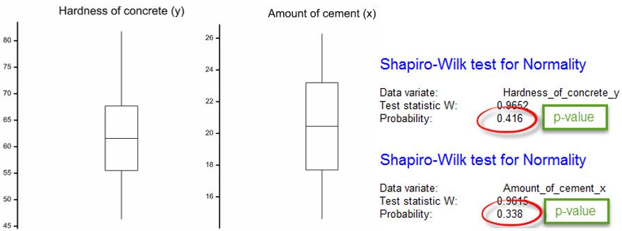
Note, the validity of our hypothesis test depends on several assumptions, including that and are continuous, jointly normally distributed (i.e. bivariate Normal), random variables. If the scatterplot indicates a non-linear relationship between and , the bivariate Normal assumption is violated. You should also check whether both the and variables appear to be normally distributed. This can be done graphically (e.g. by inspecting a boxplot, histogram or Q-Q plot) or with a hypothesis test (e.g. the Shapiro-Wilk test). For both variables in our dataset, neither their boxplot nor the Shapiro-Wilk test indicates a lack of normality.
As the hardness of the concrete is assumed to represent a response to changes in the amount of cement, it is more informative to model the data using a simple linear regression.
Here we see the Linear Regression and Linear Regression Options menu settings and the output these produce in Genstat:
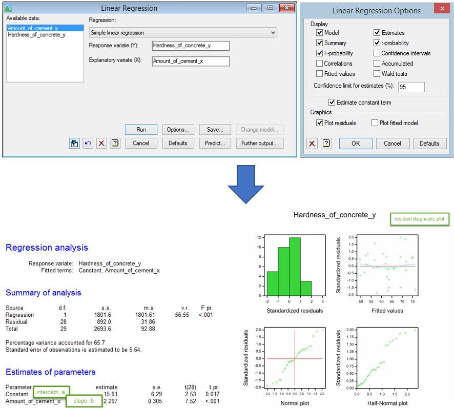
Using Genstat, we obtain the following regression line:
Predicted hardness of concrete = 15.91 + 2.297 x amount of cement
That is, the model predicts that for every one unit increase in the amount of cement used, the hardness of the concrete produced increases by 2.297 units. The predicted hardness with 20 units of cement is 15.91 + (2.297 x 20) = 61.85 units.
For a simple linear regression, we are also interested in whether there is evidence of a linear relationship with the explanatory variable. This can be assessed using the variance ratio (v.r.) which, under the null hypothesis of no linear relationship, has an F distribution. The p-value from this test is <0.001, providing strong statistical evidence of a relationship. The percentage variance accounted for summarizes how much variability in the data is explained by the regression model - in this example 65.7%.
The residuals from the regression model are assumed be independent and normally distributed with constant variance. The residual diagnostic plot (see above) is useful for helping check these assumptions. The histogram (top left), Normal plot (bottom left) and half-Normal plot (bottom right) are used to assess normality; the histogram should be reasonably symmetric and bell-shaped, both the Normal plot and half-Normal plot should form roughly a straight line. The scatterplot of residuals against fitted values (top right) is used to assess the constant variance assumption; the spread of the residuals should be equal over the range of fitted values. It can also reveal violations of the independence assumption or a lack of fit; the points should be randomly scattered without any pattern. For our example, the residual diagnostic plot looks adequate.
Summary
In summary, the Pearson correlation can be used with Genstat to determine if two numeric variables are linearly related. We have guides available to help you become an expert on Genstat which you can find here. Alternatively, you can contact a member of our team and we will discuss your business’ needs.
About the author
Dr Vanessa Cave is an applied statistician, interested in the application of statistics to the biosciences, in particular agriculture and ecology. She is a team leader of Data Science at AgResearch Ltd, New Zealand's government-funded agricultural institute, and is a developer of the Genstat statistical software package. Vanessa is currently President of the Australasian Region of the International Biometric Society, past-President of the New Zealand Statistical Association, an Associate Editor for the Agronomy Journal, on the Editorial Board of The New Zealand Veterinary Journal and a member of the Data Science Industry Advisory Group for the University of Auckland. She has a PhD in statistics from the University of St Andrew.
Vanessa has over a decade of experience collaborating with scientists, using statistics to solve real-world problems. She provides expertise on experiment and survey design, data collection and management, statistical analysis, and the interpretation of statistical findings. Her interests include statistical consultancy, mixed models, multivariate methods, statistical ecology, statistical graphics and data visualisation, and the statistical challenges related to digital agriculture.
Popular


Related Reads